Bitcoin Market Cycles Explained


Matthew Kimmell is Digital Asset Analyst and Christopher Bendiksen is Bitcoin Research Lead at major European digital asset investment firm CoinShares.
__________
To long-time bitcoin (BTC) investors, it was no surprise that bitcoin surpassed its previous all-time high in 2020. Nor was it much of a shock that it just reached new all-time highs this past month. To them, bitcoin remains a young asset that’s merely going through phases of discovery and adoption, accumulating newfound exposure and unlocking demand from broadening demographics as it matures. Price cyclicality, and its accompanying volatility, is simply par for the course.
Many have explained this cyclicality — which has thus far taken place in rough tandem with Bitcoin’s supply halvings — as successive periods of maturation. In this framework, each cycle serves as a market-broadening catalyst that spreads the ideas and narratives of Bitcoin through society and unlocks new tranches of demand.
One of the most powerful of these narratives is that of the halvings. Roughly every four years Bitcoin’s issuance rate is programmatically halved. The halvings happen without any regard to ongoing demand, meaning that if the ongoing demand remains the same after a halving event, whatever demand was being met by new supply will be restricted, necessitating an upwards adjustment of price.
The halving-driven cyclicality thesis claims that these price increases cause Bitcoin to garner further attention, capturing additional investment as the population becomes increasingly informed about bitcoin, its properties, and potential. So from the halving price increases, new demand is brought forward and the foundations of a new bull market are laid down.
Unfortunately, the data points remain few (there have been only three halvings) and so we cannot extract any clear evidence of a causal link between Bitcoin’s programmatic decrease in supply and broadening demand. However, thus far at least, the halving events appear to have been trigger events, followed by periods of substantial price appreciation.
As a counterpoint, many have argued that since the halvings are known in advance, their impact should be priced in (i.e. the Efficient Markets Hypothesis). Apart from the price development itself suggesting that this is not the case, it is also important to remember that the inner workings of Bitcoin remain completely unknown to most people on Earth, and even to many existing bitcoin holders.
Given the still low dissemination of Bitcoin knowledge in the general population, we don’t think it’s an unreasonable possibility that the halvings carry a powerful enough narrative that they cause the Bitcoin idea to spread, however, we think there is more to the cycle pattern than the halving events alone. We’ll expand on this further down the article.
Viewing and comparing cycles
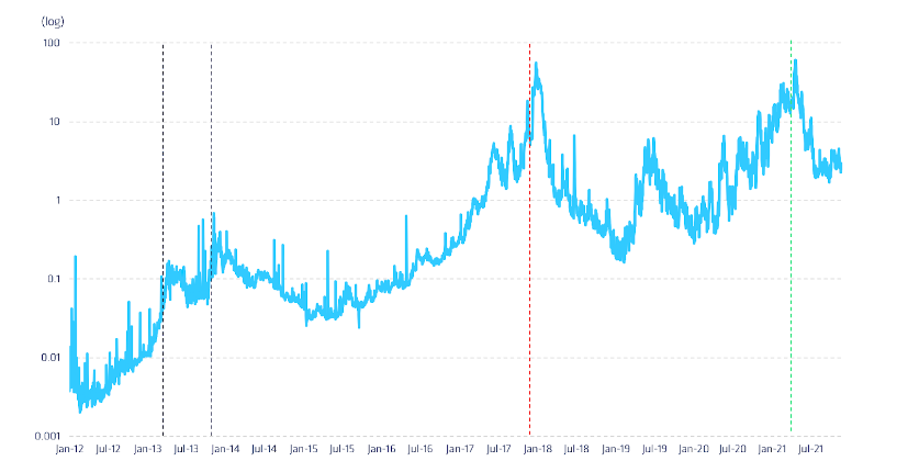
As the bitcoin price again hovers around all-time highs [note: the piece was written before the latest price decrease], let’s take a look at how price is behaving in comparison to previous bull cycles, using each halving event and price peak as signals to mark important cyclical milestones.[1]
Examining bitcoin’s market cap on a logarithmic scale, we contrast each cycle on a relative basis, tracking the percentage change in the overall network’s value rather than its absolute change over time. Using this method, we can see similar overall trends in each cycle along with certain degrees of uniqueness or irregularities.
Figure 1. Three Cycles of Bitcoin Market Cap Normalised to 1 at Halvings (usd)
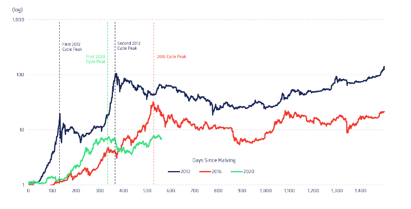
In general, in the periods immediately after halving events, bitcoin prices seem to follow a pattern of rapidly increasing above and way beyond previous all-time highs (ATH), correcting and shedding value over a slightly longer period, then oscillating in a window of diminishing volatility, before finally circling back to a more gradual upside continuation before the next halving.
In the longer term, this can be the early signs of a rising cyclical trend in prices, and there are behavioral patterns among bitcoin holders suggesting this cyclicality might continue as Bitcoin matures and adoption rises, until at some point a comparative level of saturation is reached.
General cyclical patterns
While each cycle establishes an early uptrend, they differ in precisely how they move through their initial acceleration phase. The 2012 cycle found its first point of inflection[2] in just 28 days, whereas in 2016 and 2020 the trajectory of the curve didn’t dramatically change until roughly 269 and 187 days after the halving.
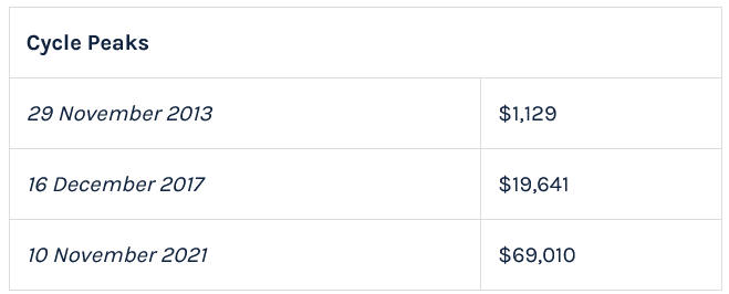
Uniquely thus far, the 2012 curve had two major ATH peaks, and reached its most significant peak only 366 days post-halving, whereas the 2016 curve didn’t find a comparable high until 159 days later, at a notably decreased level. One could make an argument that the 2016 cycle had another major peak in 2018, but it failed to reach a new ATH and so we do not consider this run-up a major bull market peak.
The initial two cycles are of similar shapes being clearly parabolic with dramatic blow-off tops, however, the most recent cycle takes a different route, being somewhat delayed in its ascent and with a much more rounded top. As the 2020 cycle is not even half-way through to its next halving, it is of course possible that it will run higher still, forming a pattern more similar to the 2012 cycle than the 2016 cycle.
Given the small sample size of halving data attainable (n=3), it may also be that these patterned cycles are more myth than reality, or that the current cycle is taking a more modest route to greater bitcoin adoption. It could also be the case that cycles are dampening in magnitude and that this cycle has already reached its peak.
But price alone does not contain a sufficient amount of information to shine the necessary amount of light on these probabilities. So in order to increase the granularity of our analysis, we must look to additional data sources for support.
On-Chain Cycle Analysis
We can examine crypto-specific metrics that may indicate how owners of bitcoin, the asset, have been interacting with Bitcoin, the network, and protocol. Since bitcoin is a traceable unit within its own public ledger system (the blockchain), we can analyze usage patterns in uniquely granular fashions. Rather than focusing on traditional technical analysis techniques, we can analyze usage data directly to assess how network (that is, user) activity may be related to price development.
Market value to realized value (MVRV)
First, we’ll explore MVRV, a crypto-native metric gauging investor behavior in context of price over time. Specifically, it measures a ratio of traditional market capitalization to realized capitalization, which is calculated by valuing each unit of supply (BTC) at the price it was last transacted on-chain. Put simply, it’s the aggregate cost basis of each bitcoin in relation to its current price. We prefer to analyze this metric alongside the price and volume charts to capture additional contextual information.
Figure 2. Ratio of Bitcoin Market Cap to Raised Cap
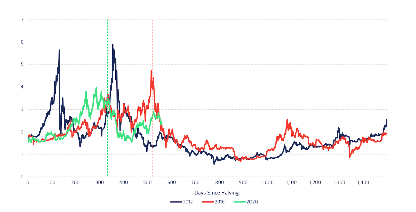
Figure 3. Market Cap (RHS) vs Transaction Value as % of Market Cap (LHS)
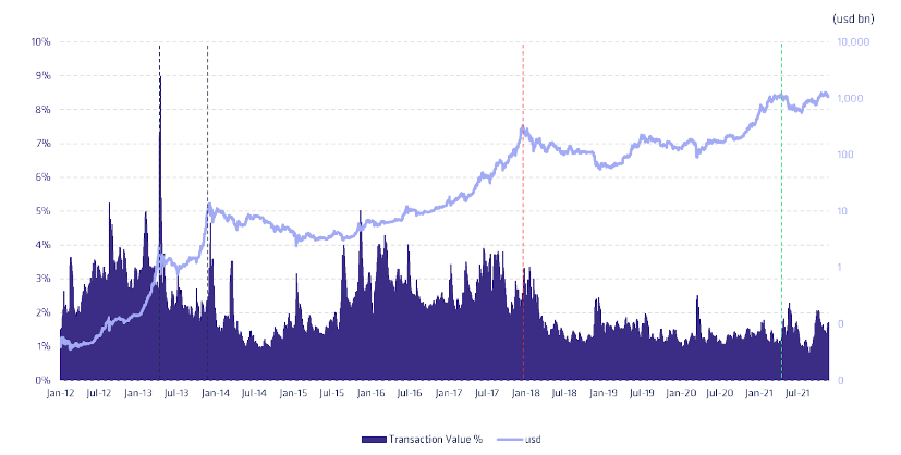
When seen in the context of on-chain transaction volumes, we observe an interesting recurring pattern emerge: as MVRV swings upward, meaning market value outpaces realized value, on-chain transaction volumes generally remain close to or only slightly above normal levels, implying that investors are largely keeping their holdings stagnant while bitcoin appreciates in price.
Then, as MVRV swings sharply downward, on-chain volume spikes, as large volumes of coins change hands at lofty prices, and realized value starts outgrowing market value. The peaks tend to precede price peaks by a short amount of time, but the MVRV metric, having price as a major component, is volatile enough that predicting indicator peaks in real-time may be tough.
On a deeper level though, the index dynamic implies that investors controlling bitcoins on-chain — that is, off exchange — might be moving coins to exchanges to realize gains. This thesis is further supported by UTXO [unspent transaction output] bands and exchange flow analysis which we perform further on in this article.
Under conditions like this, supply from existing holders flowing to exchanges overpowers demand over an extended period of time and the price enters a mid- to long-term correction. Realization of gains only comes to an end once MVRV retraces back to levels around or below 1, where the average unit of supply was last moved at the current market price.
Interestingly, in all previous periods where bitcoin holders as a group have been in the red (MVRV 4), the price has been rapidly nearing peak territory, with significant corrections on the short-term horizon.
We can interpret this cyclicality as evidence of long-term holders accumulating more supply in the most volatile parts of rapidly appreciating and depreciating markets, restricting supply in times of hardship, and then releasing supply in times of prosperity.
At the current cycle’s MVRV peak, 286 days after the halving (21 Feb 2021), the bitcoin price reached USD 57,501 and an MVRV value of 3.96. This is historically lower than previous cycle peaks (5.88 and 4.72), suggesting the possibility that the current bull market might still have some steam in it.
As MVRV corrected down to 3.0 a week later (28 Feb 2021), it seems existing holders had succumbed to the temptation of selling already as the price declined to USD 45,359 (-21%), and at 262 days before the price peak (10 Nov 2021) — an unusual pattern. However, after bottoming at 435 days after the halving, the ratio found support and is again currently rising at low on-chain volumes, indicating another bout of supply restrictions by holders who are in profit.
UTXO bands
We can gain even more insight into investors’ behavior by looking at UTXO bands, a metric that more granularly explores the transaction patterns of the blockchain by grouping transacted coins into age bands. Here, by examining the length of time each coin has remained inactive, we can gain further support to our previous inferences regarding hoarding and spending behavior among holders.
We also find that UTXO bands generally help us understand the volume of supply-constrained and then released by long-term holders in different parts of each cycle. And just like MVRV, we prefer analyzing UTXO bands alongside price and volume charts.
Figure 4. Bitcoin UTXO Bands
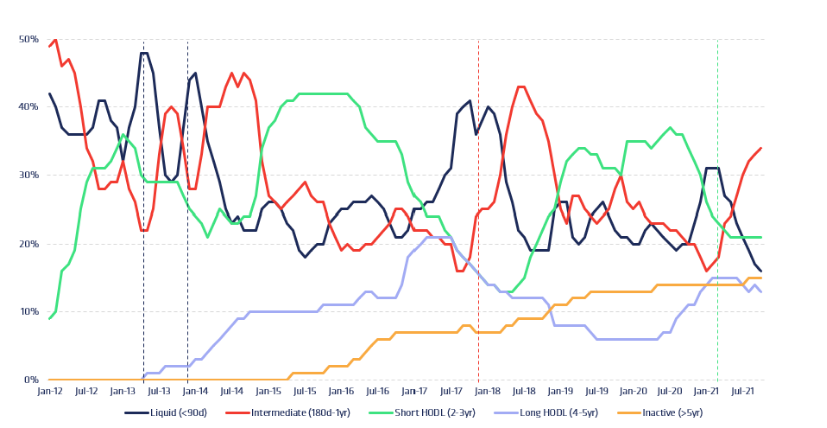
Figure 3. Market Cap (RHS) vs Transaction Value as % of Market Cap (LHS)

At first glance, UTXO bands are a bit tough to read for the untrained eye. But once readers familiarise themselves with the different bands and their cyclical patterns, UTXO bands can be a highly valuable tool for cycle analysis. Each band in the graph represents a basket of coins of a certain age range, and the y-axis represents the total percentage of all coins belonging to each respective band at any given time. They all always sum to 100%.
For simplicity, we’ll be referring to each band as follows: 0 to 90 days (blue) is called the liquid band, 6 months to a 1 year (orange) is the intermediate band, 2 to 3 years (grey) is the short HODL band, 4 to 5 years (yellow) is the long HODL band, and above five years (light blue) is the inactive band.
Overall, we find that the oldest bands are generally expanding as time advances, meaning an increasing percentage of coins are idling in illiquid and inactive addresses as Bitcoin matures. This trend suggests that many investors are more keen to hold rather than transact their bitcoin despite continuous and rising price action, restricting its market supply.
Delving deeper into the peaks and troughs of each cycle in association with these age bands, however, we also find deeper insights into how investors, particularly long-term investors, behave in each cycle. Moreover, there is also a high level of similarity between holder behaviors across the cycles, suggesting that cycle repetitions do indeed stem from similar patterns of psychological pressures on bitcoin holders.
Looking more closely at the first halving cycle of 2012, we initially find a large amount of intermediate coins growing older and progressing into the short HODL band. Then, as price gains momentum toward the first cycle peak in early 2013, we see corresponding spikes in network activity that increase the liquid band and decrease both the intermediate and short HODL bands.
Figure 5. Bitcoin UTXO Bands (2012 Cycle)
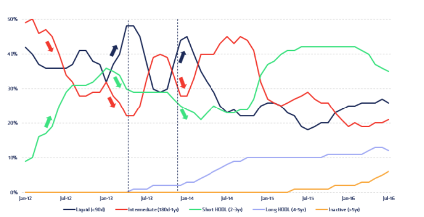
This suggests that holders in the intermediate and short HODL bands, some having held for several years already, are moving their coins, probably by sending them to exchanges to realize gains. Both MVRV and on-chain volumes also support this thesis.
Next, between the 2013 market tops, as the price corrects, many liquid coins again enter the intermediate band as the price recovers and rebounds. The pattern of the first peak then repeats, with intermediate and short HODL coins moving into the liquid band as the price approaches its peak. This time period closely resembles the price appreciation up to the first cycle peak, with MVRV and on-chain volumes both spiking at the same time. Net exchange flows also spike at the exact same time.
We can interpret this pattern as (relatively, for Bitcoin’s age) experienced investors bringing increasingly dormant coins back to market as price approaches and exceeds all-time highs. High transaction levels also generate a new tranche of investors entering the market at relatively lofty price levels, setting the stage for a correction in MVRV. As the market corrects beyond the first cycle peak, these newer investors find themselves at a loss and end up removing coins from the market. Not until price eclipses their cost basis on the second peak do they bring their coins back to exchanges for sale.
Figure 6. Bitcoin UTXO Bands (HODL Waves)
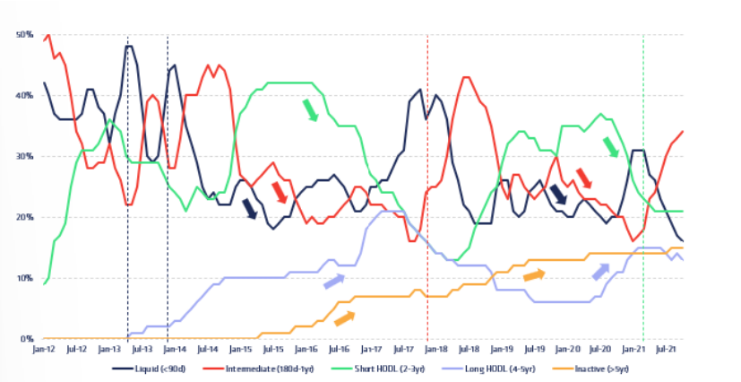
As bitcoin’s price begins to gain momentum after each halving, the average age of coins grows older reflecting the broader secular trend (this is called a HODL wave). With more coins entering dormancy, available supply is increasingly restricted before being further exacerbated by a supply halving. When demand picks up from a gradual broadening of the population’s exposure to bitcoin and its investment case, demand again overpowers supply and price starts accelerating towards new ATHs.
With the price ascending past its previous peak, we see spikes of expansion in the more liquid bands as well as contraction in mid-term bands, moving coins from the intermediate and short & long HODL bands. This movement of coins on-chain ostensibly signals that older wallets are realisrealizinging gains as the opportunity presents itself. Then, as bitcoin’s price corrects downwards towards its former all-time high, coin age again starts to grow, supply is restricted, resistance is found and price stabilizes.
Exchange flows
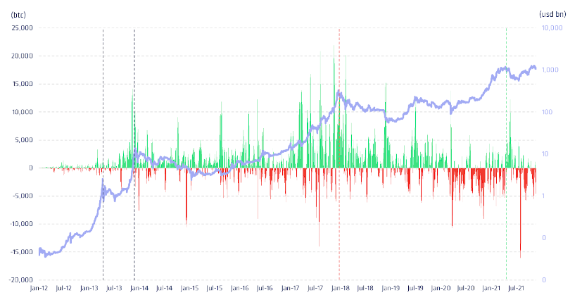
The last puzzle piece in our behavioral cycle analysis is net exchange flows. Using on-chain transaction data it is possible to estimate the amount of bitcoin flowing to and from bitcoin exchanges, giving us valuable insight into the purpose of a significant part of the on-chain transaction volumes. While these estimated flows are not perfect representations of real flows, they are very good estimations.
Looking at the net exchange flows we can observe that periods of high MVRV, the same periods where coins from relatively old UTXO bands re-enter the liquid band, all correspond to periods of large positive net exchange flows. This final piece of evidence ties the dynamic supply thesis of bitcoin holders together and helps finalize the explanation of the underlying behaviors causing price cycles.
Figure 7. 7d Moving Average of Net Exchange Flows[3] (btc) vs Market Cap (usd)
Caveats
It’s worth noting that UTXO bands do not adjust for supply that is currently inaccessible/lost (increasingly illiquid bands) or other on-chain transactions that aren’t accurately deemed sales (increasing liquid bands). It is very possible that the seemingly ever-aging band of coins in the inactive band reflect coins that cannot ever move again.
UTXO bands do not reveal the economic intent of transactions, meaning that many observed on-chain transactions may be unrelated to selling. However, it is not necessary for the validity of the dynamic supply thesis that all observed transactions reflect selling intent, only that a sufficient amount of them do.
Figure 8. Average Bitcoin Transaction Fees (usd)
Moreover, the high fee environment associated with cycle peaks also disincentives investors to conduct other on-chain transactions (UTXO consolidations, CoinJoins, Lightning Opens/Closes). Therefore, while it is possible that many coins in the lowest-age bands are the result of transactions unassociated with selling, its environment is highly unfavorable for non-trade-related transactions given the state of the fee market.
The dynamic supply cyclicality thesis summarised
In short, the cyclical repetition of bitcoin price movement is theorized to indicate successive new classes of long-term investors being initiated to bitcoin each cycle. These investors resist the urge to sell their coins below acquisition cost during at least one cycle downturn, restricting supply as they hold on to coins until finding profits in the next upswing. Their success in turn emboldens a new generation of long-term holders, who are often brought into bitcoin by a powerful narrative such as the supply halving, to undergo the same rough sequence of events and the cycle repeats.
In accordance with the maturation concept explained above, this could imply that discovery and exposure of bitcoin by broader audiences, who observe the success of previous cycle holders, may act as a catalyst unlocking additional tranches of demand and enhancing its value proposition in successive waves of adoption.
While it remains anyone’s best guess whether bitcoin will keep following the exact same patterns and trends established by previous price cycles, unlocking new levels of demand as it goes, investors can at least feel reasonably assured that human psychology will remain unchanged and that Bitcoin will continue cutting its issuance rate in half every four years until it reaches its 21 million supply limit.
Meanwhile, successive generations of bitcoin holders keep facing the same psychological pressures to restrict and release supply in a similar fashion to previous holders when faced with similar price conditions. Taken together, these factors do point to at least some probability that bitcoin price cycles might continue in a similar fashion as they have in the past.
__
[1] We’ve ignored bitcoin’s launch period — up until the first halving — as the asset hadn’t been attributed a tradeable market price until 2010.
[2] Measured as price growth of a minimum 100% over the following 50 days.
[3] These flows do not include flows to Mt.Gox which was the largest exchange by far during the bull market phase 2012 halving cycle.
____
This article first appeared on CoinShares’ website.
____
Learn more:
– Bitcoin and Ethereum Price Predictions for 2022 – Crypto News
– Bitcoin Shows ‘Overwhelming’ Institutionalization After ‘Significant Deleveraging’
– Crypto Investment Trends in 2022: Brace for More Institutions and Meme Manias
– Watch: CryptoBirb on Trends in Crypto Trading, His Exit Strategy, Bear Market, and More
– ‘Extreme Volatility’ Expected as Bitcoin Investors Learn to Value It
– Watch: Tone Vays on Bitcoin Narratives, Bear Market, DeFi, NFTs, and Ethereum
- Google Gemini AI Predicts XRP Price Will Surprise Everyone in the Next 60 Days
- Mark Zuckerberg’s Meta AI Just Revealed This Shocking Bitcoin Price Prediction for the End Of 2026
- Perplexity AI Predicts XRP Will Hit This XRP Price by End of 2026
- Crypto News, July 16: All Eyes on Tomorrow’s Clarity Act Hearing as Bitcoin and Ethereum Hold Key Price Levels
- Cardano News: Cardano’s Van Rossem Hard Fork Activates Tomorrow, And Whales Are Buying While Traders Go Short


2M+
250+
8
70


- Google Gemini AI Predicts XRP Price Will Surprise Everyone in the Next 60 Days
- Mark Zuckerberg’s Meta AI Just Revealed This Shocking Bitcoin Price Prediction for the End Of 2026
- Perplexity AI Predicts XRP Will Hit This XRP Price by End of 2026
- Crypto News, July 16: All Eyes on Tomorrow’s Clarity Act Hearing as Bitcoin and Ethereum Hold Key Price Levels
- Cardano News: Cardano’s Van Rossem Hard Fork Activates Tomorrow, And Whales Are Buying While Traders Go Short
More Articles