How to Read Candlestick Charts for Beginners
The text below is an advertorial article that was not written by Cryptonews.com journalists.
When you begin trading for the first time, it’s easy to become overwhelmed by the charts. Many things are going on at one time, all that provide valuable information to make a successful trade. Not knowing what the chart is telling you could cost you considerably at the end of the day.
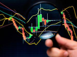
Whether you’re Australian forex traders or in the United States, one chart type popular amongst traders is the candlestick chart. First started in Japan, this chart style is relatively easy to read and provides lots of information to the user. The name comes from how the chart looks – rectangle shapes with lines coming out of either end resemble what a candle with a wick seems like.
We created a quick guide on reading candlestick charts for beginners because of how essential the candlestick chart is.
The Rectangles
As mentioned above, the rectangles on the chart are the candlestick. Each candlestick shows the trader the open price, the highest and lowest it hit for a designated time period, and the closing price. The trader can dictate the time period, ranging from minutes in a day to days in a year.
For example, if you open a candlestick chart with a timeframe of five minutes, you would see a new candlestick (rectangle) for every five minutes in the day.
The Price Change
We know that each candlestick represents the price change in a specified time, but how can you tell the change? Depending on the price movement (increase or decrease), the top or bottom of the candlestick dictates the open and close price.
You’ll notice that each candlestick is either green for an increase in price or red (sometimes black) for a price decrease. For the green candlestick, the opening price is the bottom, making the top the closing price, and vice versa for the red or black candlestick.
The Highs and Lows
The rectangle shows the price change range, but how can you tell the highest and lowest point in the specified time period? Some charts have shadowed rectangles above or below the colored one, while other charts have a thin line from either end of the candlestick, also called the candle’s wick. The shadows or lines represent the highs and lows during the timeframe.
If the candlestick went higher than the open or close price, you’d notice the wick at the top of the candle (the length varies on how high the price went). There will be a wick at the bottom of the candlestick for prices that dropped lower than the open or close.
If you want to calculate the designated time price range, you will subtract the low price from the high price. That number would be the price range movement.
Once you have a basic understanding of the rectangle, color and lines or shadows on the chart, it’s relatively easy to understand. The candlestick chart is excellent for interpreting patterns and spot trading opportunities for maximum profit.
If you need a bit more help understanding charts and determining how to make the best trade, a broker may be worthwhile. Check out this list of top regulated brokers that are trustworthy and regulated to help you maximize your profits in every trade.
How can you predict a market reversal?
This technique allows you to predict market turning points and find trading opportunities with a low risk-to-reward ratio.
- The price reaches a key market structure at a higher timeframe (for example, a support or resistance level or a trend line).
- The current trend shows weakness and smaller candles appear.
- The pullback strengthens and candlesticks of a larger size appear.
- We enter the market on a breakthrough of the current structure.
On the daily timeframe the price is in the resistance area, which converges with the downtrend line:
On the smaller timeframe, the sellers’ pressure is increasing and the pullback candles are getting bigger. In addition, buyer pressure is decreasing as the trendline candlesticks are getting smaller.
Higher lows near resistance levels are a sign of strength.
It is important to pay attention to how exactly the price approaches the resistance level. If you see price gradually pulling up towards the level and higher lows occur, it is a sign of strength. Buyers are willing to buy at higher prices and sellers are unable to push the price lower.
This pattern is called an ascending triangle.
If price moves sharply close to a level in the big candlesticks, a bounce is likely to follow
Strong market momentum, which is moving down rapidly, indicates that there are no buyers in the market to hold the price. The market continues to fall in order to attract buyers. This downward price flow is called a liquidity gap or lack of interest because not many trades occurred when the price was falling.
More often than not, it means that the market can easily turn in the opposite direction due to a large accumulation of buyers at a certain level.
{no_ads}